“If a third of the features you release perform as well as you’d hoped, you’re doing very well” – Jeff Patton
Team Quick had reached the end of the quarter, with all of their planned features complete. As part of their release retrospective, they spent the first thirty minutes reviewing their estimates vs. how long things actually took. The team high-fived each other as this was the closest they’d ever gotten to the estimates they’d given. Jean, the team’s Product Manager, entered the room with a glum look on her face. “The feedback from our customers on what we shipped is not good – we need to roll back.”
Pattern: Visualising actual outcomes
What the team did here was actually have a discussion around predictability and cost – did what they think they would spend come close to the actual spend? That is a valid discussion, but only one half of the equation. They also need to know the actuals on outcomes – did the value they forecast actually come to pass?
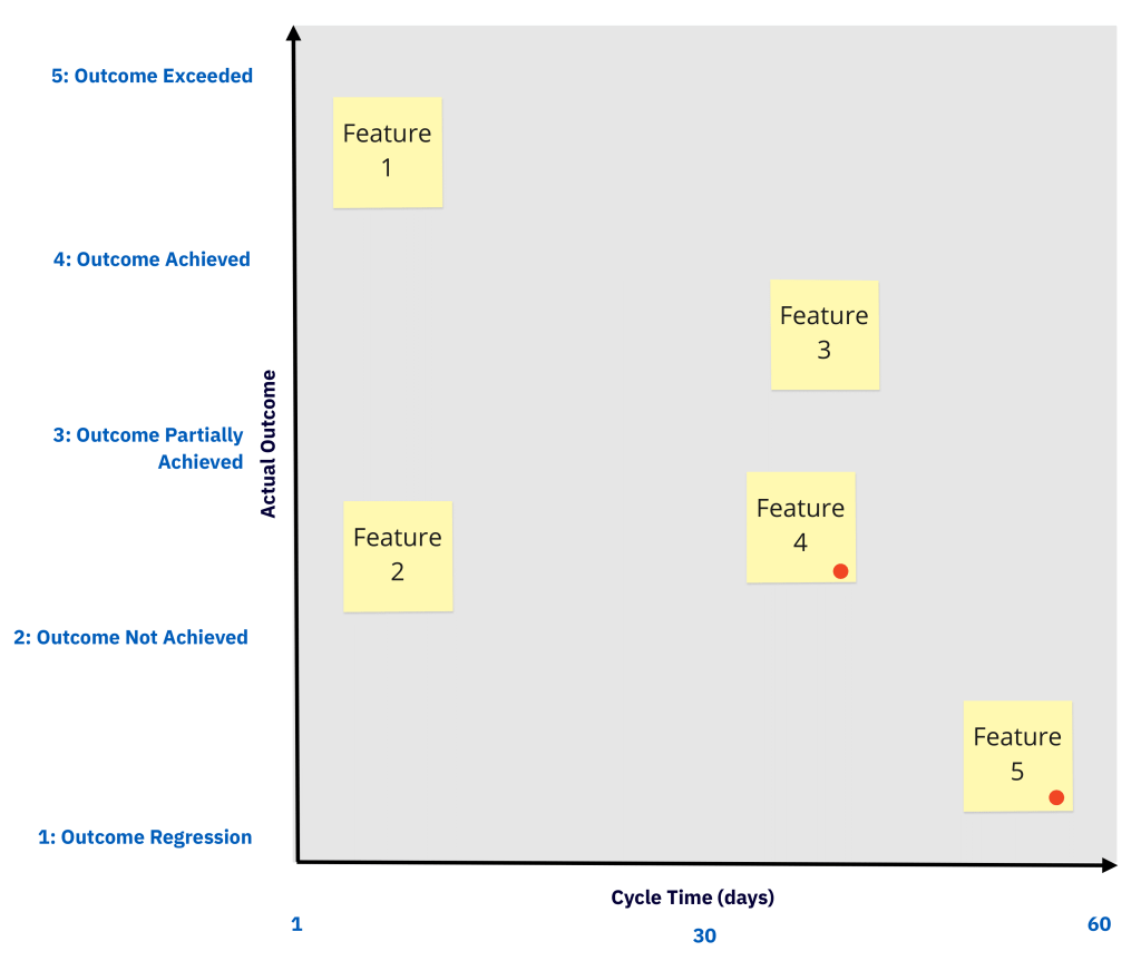
In order to review the ratio of what actually happened on the value vs. cost side, we recommend using an Outcomes Matrix. This is a simple technique to get a basic understanding of the actual ROI of the features you shipped.
On the Actual Outcome axis, for each feature, on a relative scale 1-5 (low to high), plot where it actually landed. For example, if you are tracking product usage metrics, convert those behavioral analytics into 1-5, in relation to what you had targeted in your original hypothesis statement. The scale is as follows:
- 5: Outcome Exceeded: a more positive change in user behaviour than initially targeted has resulted;
- 4: Outcome Achieved: the targeted positive change in user behaviour has resulted;
- 3: Outcome Partially Achieved: some positive change in user behaviour has resulted, but not as much as targeted;
- 2: Outcome Not Achieved: the target result has not been achieved, but has not caused a negative change in user behaviour;
- 1: Outcome Regression: a negative change in user behaviour has resulted.
Consider, relative to each other, how much they met the desired outcomes / changed in user behaviour. Or perhaps you used something like a Customer Impact Score, which you can map to here instead. For example, 5 (Outcome Exceeded) could be that we targeted a 10% reduction in time for a user to navigate the checkout page, but we hit a 17% reduction in reality.
On the Cycle Time axis, plot the cycle time of each feature. Cycle time measures the amount of time it took from work starting on a feature to it being delivered. It is a metric originating from Lean, and it is one of the most important metrics for product development teams. Cycle time is better to retrospectively measure than estimates, because it is the time the feature actually took to deliver, including not just work time, but also wait time. Cycle time is usually measured in calendar days. Rather than the original estimated t-shirt size/points, use actual elapsed cycle time here. Any items which took longer than expected, mark them with a dot.
As part of a regular retrospective, review your Outcomes Matrix. Review the Outcome vs Time ratio for each shipped feature. This helps start useful discussions:
- Why did some features take longer than forecast?
- What was the relationship between outcomes and time for each feature? Was there any?
- Why did the lower ranked outcomes perform less well?
- What can we do to improve both cycle time and outcomes for our next steps?
Any items which have achieved/exceeded their outcome, and have completed retrospective discussion, remove them from the Outcomes Matrix. This tool is intended as a conversation starter, and should be used as a continuous tracking technique for reviewing return on investment.
By using this tool, Product teams can shift from discussing just outputs (features, cycle time) to additionally discuss outcomes in a simple, visual format.
